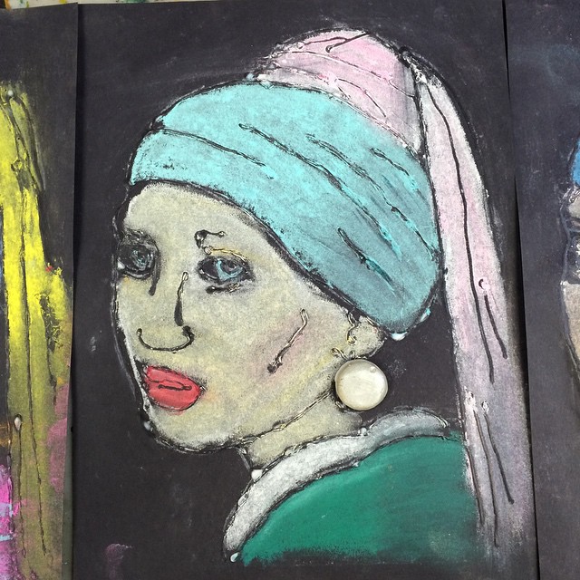
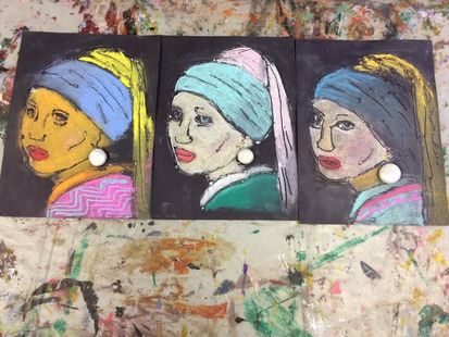
So this is my first blog post, I just wanted to keep track of some of the lessons and information that I have gathered and learned from starting to teach art at a summer camp. I will try to post one a day and this lesson is my new fave (for 6-11 year olds)! Its called the Girl with a Pearl Earring Drawing Lesson. Teach the students about Vermeer and how he used the camera obscura and chiaroscuro to create his paintings. Then you (the teacher) do a simple drawing of the painting and make photo copies. After that show the students how you can take white chalk (I used white conte crayon but either will do) and cover the back of the photo copy with the chalk. Then take 8.5 x 11 black construction paper, and lay the photo copy face up and trace the drawing onto the construction paper. After that take regular Elmer's glue and only using a small amount and keeping the tip of the glue on the paper at all times draw with glue over the traced white chalk. As it dries take a small amount of air dry clay, roll a ball, and lightly push down creating your pearl. Air dry clay sometimes can be painted immediately (I do) paint the pearl with a metallic color. Then when your glue drawing is dry, using chalk pastels, show your students how to draw light to dark using chiaroscuro. When they are done glue the pearl on the drawing and they are done!!
7/17/21015
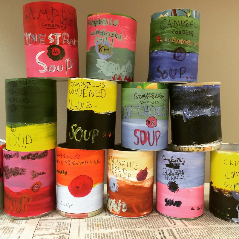
So here is a new day and a new lesson! Ive been wanting to do a good Andy Warhol lesson and after combining a few elements from different lessons I've seen before I came up with this one based on his Campbell's Soup cans (for 6-11 year olds again but could def be modified for older kiddos).
So here is a new day and a new lesson! Ive been wanting to do a good Andy Warhol lesson and after combining a few elements from different lessons I've seen before I came up with this one based on his Campbell's Soup cans (for 6-11 year olds again but could def be modified for older kiddos).
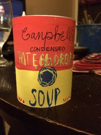 | 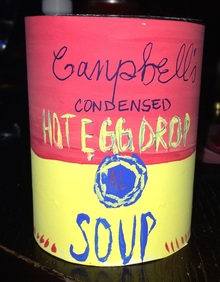 |
First I gave students the background on Pop art, telling them about how this art movement is based on items that are in their everyday world but is made into art (like a spoon or a can of soup). Then I gave a background on Andy, always a fun thing to do, very interesting guy. After that we looked at a few of his Campbell's soup cans and talked about the color combinations he came up with. Next we got a scrap piece of paper and practiced writing
(1) Campbell's (I wrote it on the board in cursive and capital, I told them I wanted them to jazz up their font)
(2) condensed (can be plain and lower case)
(3) to make this a little more fun I had them come up with their own soup flavors, some struggled so I told them they could use a traditional flavor (chicken noodle) but I wrote every flavor they came up with on the board so they knew how to spell it.
(4) in the center I had them draw a circle and practice their first at last initials (surprisingly this was difficult, some do not understand the concept of their own initials).
(5) at the bottom we practiced writing in big letters SOUP.
(6) on the bottom corners we did Net Wt. (their age) oz., so mine said Net Wt. 29 oz. They loved doing this
(7) in the other corner we did cal (they come up with calories) mine was cal 60.
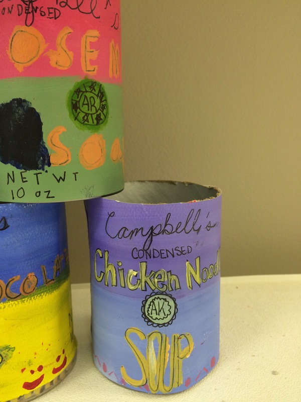
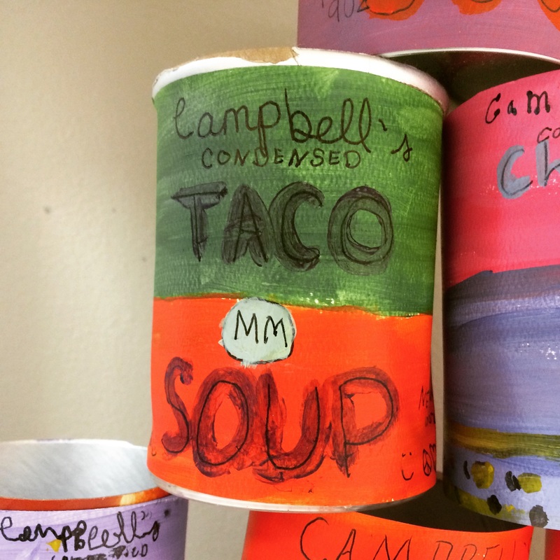
After they practiced writing this in sequential order I cut Pringle cans to the size of a regular can of soup, then I took watercolor paper (any thicker paper will do) and cut it to fit around the cans, the label paper ended up being really long rectangles. After that we came up with a different 3 color scheme for each flavor like pink, green, and blue. We used rulers, and drew a line down the middle of our label, painting one of our chosen colors on one side and one on the other. Using pens we wrote in the center of our painted labels all the stuff we practiced, I had them paint over their soup flavor and the word soup. Also, I had them do little decorations around the word soup. Lastly, I took double sided tape and put it on the back of their labels and attached! They looked great! Loved stacking them together.
(1) Campbell's (I wrote it on the board in cursive and capital, I told them I wanted them to jazz up their font)
(2) condensed (can be plain and lower case)
(3) to make this a little more fun I had them come up with their own soup flavors, some struggled so I told them they could use a traditional flavor (chicken noodle) but I wrote every flavor they came up with on the board so they knew how to spell it.
(4) in the center I had them draw a circle and practice their first at last initials (surprisingly this was difficult, some do not understand the concept of their own initials).
(5) at the bottom we practiced writing in big letters SOUP.
(6) on the bottom corners we did Net Wt. (their age) oz., so mine said Net Wt. 29 oz. They loved doing this
(7) in the other corner we did cal (they come up with calories) mine was cal 60.
After they practiced writing this in sequential order I cut Pringle cans to the size of a regular can of soup, then I took watercolor paper (any thicker paper will do) and cut it to fit around the cans, the label paper ended up being really long rectangles. After that we came up with a different 3 color scheme for each flavor like pink, green, and blue. We used rulers, and drew a line down the middle of our label, painting one of our chosen colors on one side and one on the other. Using pens we wrote in the center of our painted labels all the stuff we practiced, I had them paint over their soup flavor and the word soup. Also, I had them do little decorations around the word soup. Lastly, I took double sided tape and put it on the back of their labels and attached! They looked great! Loved stacking them together.
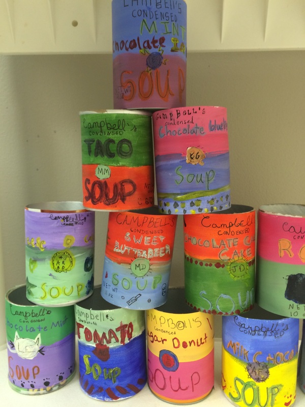
 |  Above is my older group of kids. |
Above is my younger kiddos.
7/19/15
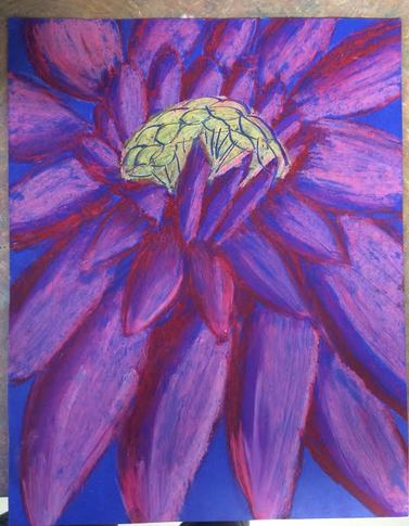
Hi! Didn't get to post on Friday, so this is to make up for it. This is a fairly simple lesson on Georgia O'Keefe. I think its a good end of the week project because there is no painting involved, only oil pastels so it makes an easy clean up. So we learn about Georgia and her history, then we talk about how her flower art evolved to have a closer and closer perspective. Then we go over what perspective is in art, I usually say that it is the illusion of depth in an artwork that makes it look 3D (or real). Then I tell them that we are going to do a bee's eye view of a flower. I found lots of beautiful up close shots/photos of flowers and printed them out. Then we used our fingers as viewfinders to find the perfect composition, as they are doing that I hand out cut posterboard (larger than 8.5 x 11) that is in different colors, I like the different colors because it adds something special to artwork and I like to use posterboard because of the smooth texture is good for oil pastel blending . I show students how to do a quick sketch of their flowers by just mapping out where everything is going to go and that this flower has to fill the whole board, I also told students this process should not take more than 2 minutes, the focus is not on the sketch. Next I show them a demo of how to layer colors with oil pastel and how to use a paper towel to pull the oil pastel and create a flower petal effect, I feel like most students want to scrub the oil pastel with the towel, NO take your finger and pull, another suggestion is the chunky oil pastels, not the thin ones- they are just a better product for students in general. When they are done they all looked fantastic. The picture below was an 8 year old student.
Hi! Didn't get to post on Friday, so this is to make up for it. This is a fairly simple lesson on Georgia O'Keefe. I think its a good end of the week project because there is no painting involved, only oil pastels so it makes an easy clean up. So we learn about Georgia and her history, then we talk about how her flower art evolved to have a closer and closer perspective. Then we go over what perspective is in art, I usually say that it is the illusion of depth in an artwork that makes it look 3D (or real). Then I tell them that we are going to do a bee's eye view of a flower. I found lots of beautiful up close shots/photos of flowers and printed them out. Then we used our fingers as viewfinders to find the perfect composition, as they are doing that I hand out cut posterboard (larger than 8.5 x 11) that is in different colors, I like the different colors because it adds something special to artwork and I like to use posterboard because of the smooth texture is good for oil pastel blending . I show students how to do a quick sketch of their flowers by just mapping out where everything is going to go and that this flower has to fill the whole board, I also told students this process should not take more than 2 minutes, the focus is not on the sketch. Next I show them a demo of how to layer colors with oil pastel and how to use a paper towel to pull the oil pastel and create a flower petal effect, I feel like most students want to scrub the oil pastel with the towel, NO take your finger and pull, another suggestion is the chunky oil pastels, not the thin ones- they are just a better product for students in general. When they are done they all looked fantastic. The picture below was an 8 year old student.